


NICE is a benchmark in the jewelry industry thanks to its focus on quality, innovation and social responsibility.

At AIM, we understand that not all brands should speak the same way.
And NICE, as a jewelry brand built on aspiration, community, and emotional connection, demanded a different way of thinking from the very beginning.
The challenge was not to produce promotional items. That part is easy.
The real challenge was something deeper: how to translate an elegant, emotional, and lifestyle-driven brand into everyday objects without diluting its essence.
NICE needed promotional products that could live beyond events and campaigns—items capable of accompanying its community through travel, daily routines, and digital interactions, without ever feeling generic or disposable. Each piece had to fulfill a dual role: be genuinely useful while communicating brand values quietly and confidently.
Visual coherence was non-negotiable. There was no room for excess graphics or loud executions. The NICE identity had to remain clean, recognizable, and consistent across every item, regardless of its function or format.
In short, the challenge was to ensure that promotional items were not perceived as add-ons, but as a natural extension of the NICE brand universe.
The solution began with a strategic shift in mindset: prioritizing usage over immediate visual impact.
We selected products designed to exist in real life—items that move with people, integrate seamlessly into their routines, and generate brand exposure organically.
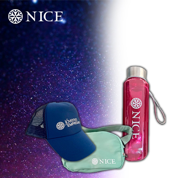
The promotional portfolio included:
Each product was chosen with a clear purpose: frequency of use. What is used is remembered. What is remembered builds brand equity.
From a branding perspective, a precise and deliberate decision defined the project: all items would feature the NICE logo applied through single-color screen printing, in one position only.
Rather than limiting the design, this choice elevated it.
Screen printing delivered durability, consistency, and a refined aesthetic aligned with the brand’s character. The logo does not compete with the object—it complements it. It does not dominate; it integrates.
As a result, every item—despite serving different purposes—spoke the same visual language, reinforcing brand recognition and coherence.
The impact of the project was not measured solely by distribution volume, but by real presence.
The promotional items began appearing in authentic contexts: at events, during travel, in everyday use, and within digital content created organically by the NICE community. The brand gained visibility without interruption, presence without intrusion, and recall without overstatement.
The outcomes were clear:
From AIM’s perspective, this project reaffirmed a core belief: when promotional items are created with intention, they stop being accessories and become long-term brand touchpoints.
The NICE case proves that the true value of a promotional item lies not in its shape, but in its ability to live within the user’s world without asking for attention.
Know more about our promotional products.


.png)