


Coca-Cola Coca-Cola is a global company recognized for its wide range of refreshing beverages, committed to innovation and sustainability in its operations and products.
In Mexico's traditional channel, the corner store is not just a point of sale: it is the commercial heart of the neighborhood. Mexico has over 700,000 grocery stores that define the identity of neighborhoods, districts, and communities across the country, and Coca-Cola understands this better than anyone. 90% of Coca-Cola's customers in Mexico belong to the traditional channel. Winning that channel is not a strategic option: it is the strategy.
But being present in it is not enough. The real challenge is how a brand shows up: with what order, what visual impact, and what ability to turn the store's daily foot traffic into real sales across three distinct categories simultaneously.
The traditional channel has its own rules. Spaces are tight, assortments are wide, competition for every inch of counter space is relentless, and shoppers make decisions in seconds. In that environment, a brand the size of Coca-Cola faces a paradox that is easy to overlook: its portfolio is broad enough to get lost in its own noise.
Food, hydration, and nutrition are three categories with different consumption logics, different shopper needs, and purchase moments that do not always align. Displaying them together without a clear system creates confusion. Displaying them separately without visual coherence fragments the brand's presence.
The objective was precise: develop a display system that gave each category its own visual and functional territory within the traditional channel — while maintaining brand unity, simplifying the shopper's purchase decision, and making the most of every square centimeter available inside the store.
As James Quincey, former CEO of The Coca-Cola Company, framed it, the premise guiding the brand's commercial strategy is as simple as it is demanding:
"We are meeting our consumers where they are."— James Quincey, former CEO and Chairman, The Coca-Cola Company
In Mexico's traditional channel, that "where they are" is the corner grocery store. And to show up there with the presence Coca-Cola demands, product alone is not enough. What was needed was architecture.
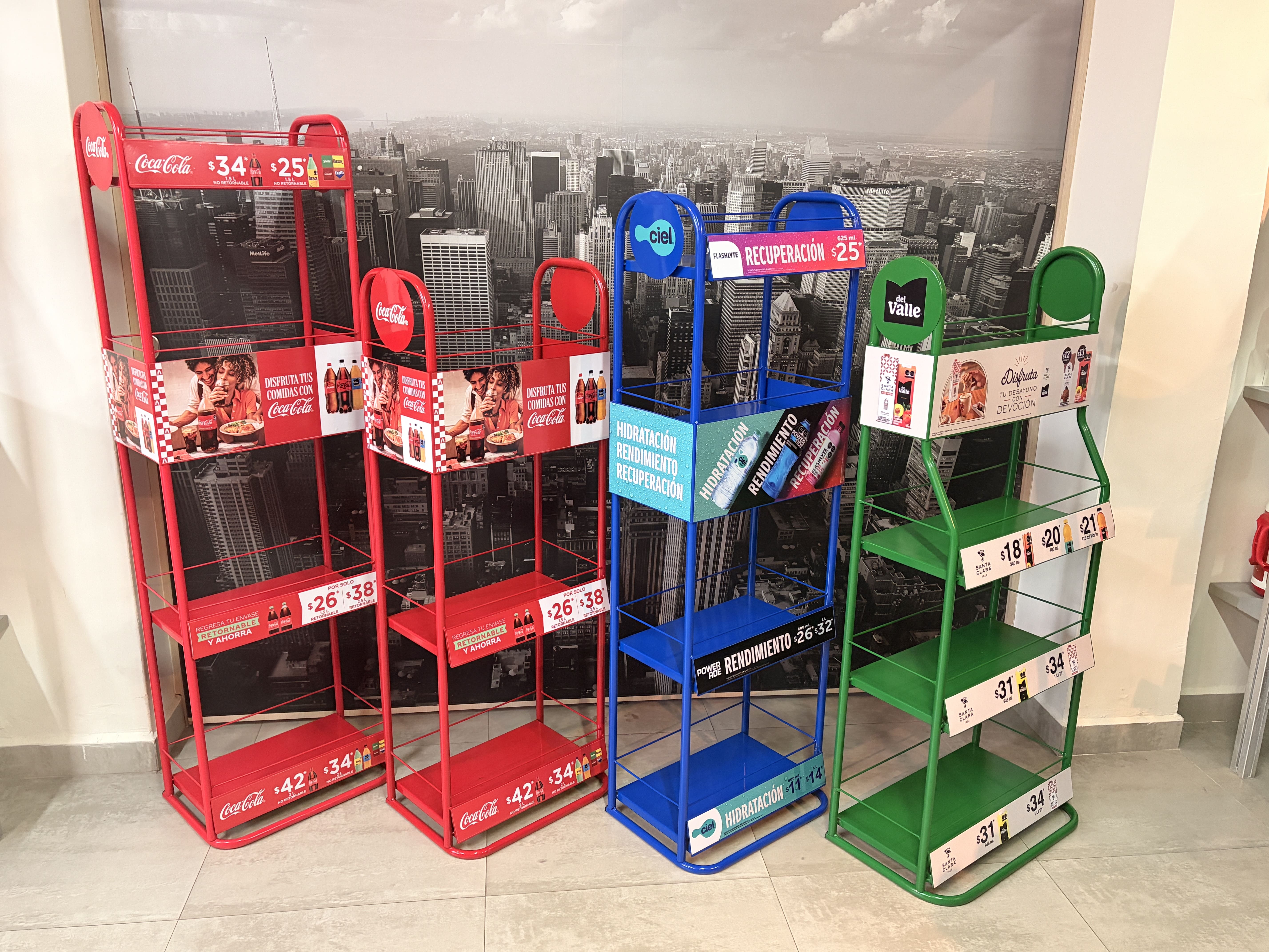
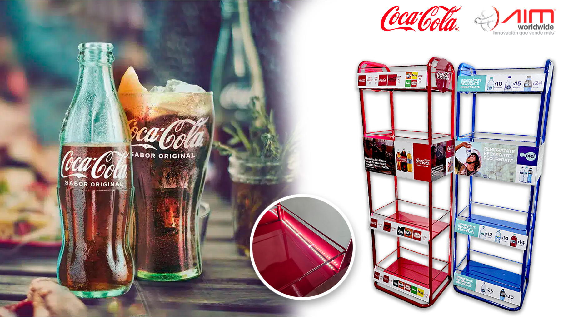
AIM designed, developed, and produced an integrated three-display system for Coca-Cola's traditional channel — each unit tailored to its category, all built on the same structural logic and the same quality standard.
The three displays share the same construction DNA: 3/4" gauge-23 steel tubing, gauge-26 sheet metal trays and header rails, 5mm rod barandals, and electrostatic paint in a finish that differentiates each category by color. What changes between them is not the engineering: it is the message.
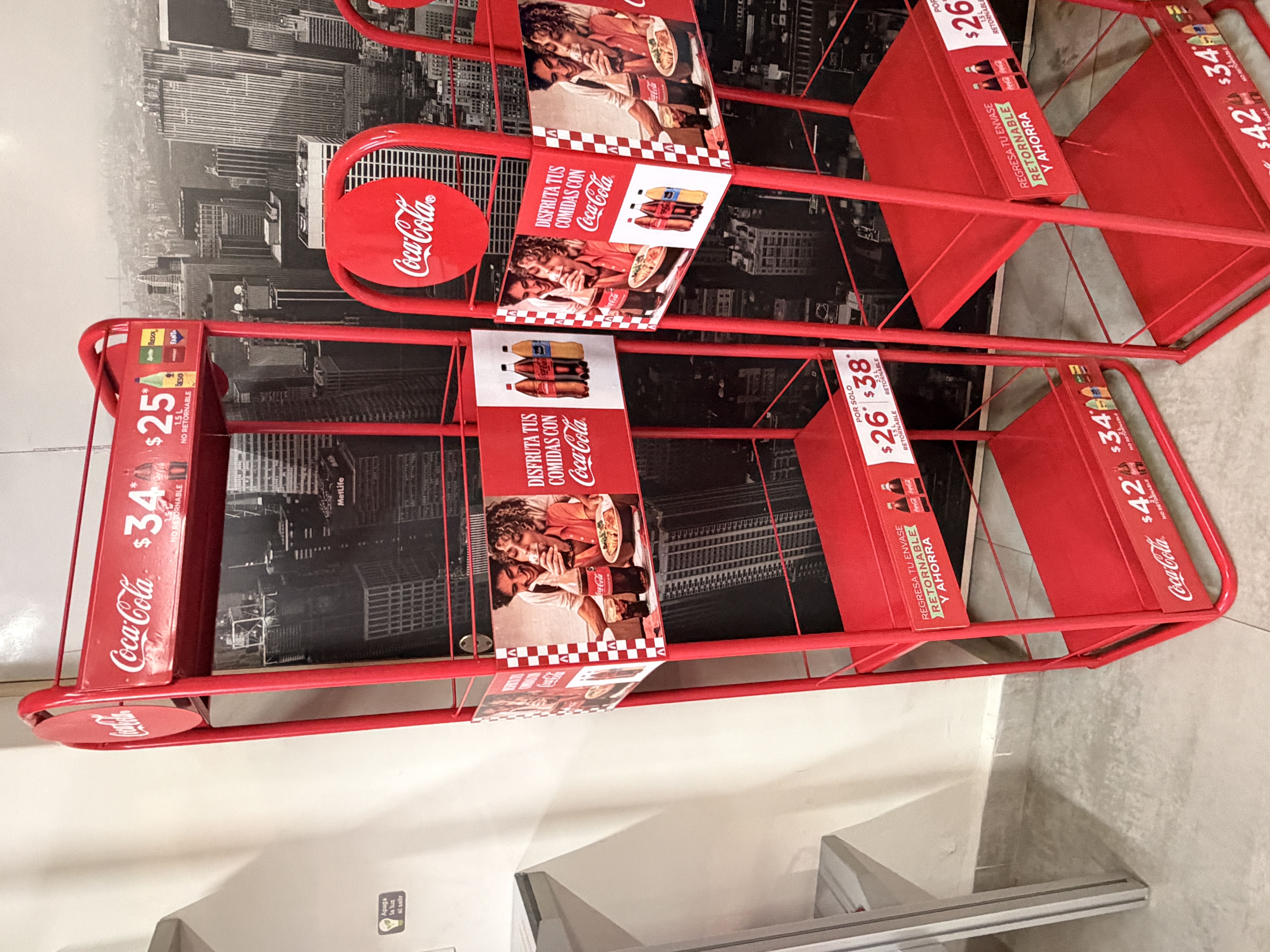
Food Display — Red46 cm × 31 cm × 140 cm. Four levels in Coca-Cola red — the color the shopper already associates with the brand before reading a single word. The forward-tilted header rails address one of the most persistent problems in the traditional channel: price legibility. The sheet metal header with self-adhesive vinyl graphics positions the brand message at the height where the shopper's eye naturally travels. And the optional LED kit — a flexible cool white light strip with concealed wiring between trays — turns the display into a functional piece even in the dimly lit corners that are far more common in corner stores than most people assume.
Hydration Display — Blue46 cm × 31 cm × 140 cm. Same structure, now in blue: the color of Ciel, of hydration, of water. A shift in tone that tells the shopper, without a single word, which category they are looking at. The tilted header system replicates the price-legibility logic, and the optional LED kit extends the display's performance in any lighting condition.
Nutrition Display — Green56 cm × 31 cm × 130 cm. Slightly wider to accommodate the scale of breakfast and nutrition products, finished in green, with the same four-level architecture. The self-adhesive vinyl header communicates the consumption occasion: breakfast — the moment of the day when this category is most relevant to the shopper.
Three displays. Three colors. Three category territories. One system the store owner can organize logically, the field rep can stock efficiently, and the shopper can read in a second.
The rollout of the display system across the traditional channel produced an effect that goes beyond product organization: it changed the way shoppers interact with Coca-Cola's portfolio inside the store.
The first result was categorical clarity. By giving each category its own display with a defined color identity, shoppers stopped searching and started finding. Red for food, blue for hydration, green for nutrition: a visual code that needs no explanation and works even for the shopper who walks in with two minutes and one specific need.
The second result was space efficiency. The three displays, with footprints ranging from 46 to 56 cm wide, occupy a manageable footprint for the grocery store format without crowding the traffic flow or competing with the store owner's counter. Every centimeter of the structure works: from the header that communicates to the bottom level that sells, through the tilted rails that surface the price without asking the shopper to lean in.
The third result was activation at the moment of decision. The LED lighting option — available across all three models — gave Coca-Cola the ability to bring brand light into the darkest corners of the traditional channel. In a corner store where general lighting can be limited, an illuminated display does not just attract attention: it stands out above everything else in the space.
The fourth result was operational scalability. Because the system is built on a shared structural logic, the production, delivery, and installation process is simplified across every point. The field rep recognizes the structure, the store owner understands the layout, and the brand maintains visual consistency across thousands of points of sale at the same time.
The objective set from the beginning was met: Coca-Cola arrived in the traditional channel with a system that organizes its portfolio, respects the store owner's space, and speaks directly to the shopper at the moment that matters most.
What This System Opens Up for Your Brand
For consumer goods brands with multi-category portfolios operating in the traditional channel, the Coca-Cola — AIM case traces a concrete path forward.
A display system with color-coded category identity removes friction from the purchase decision. The shopper does not need to read: they need to see. Color does the segmentation work before the eye even stops on the product.
The integrated LED lighting option is not a premium add-on: it is a real competitive advantage in a channel where point-of-sale lighting is rarely under the brand's control.
Forward-tilted header rails solve one of the most documented problems in the traditional channel: price illegibility. A shopper who cannot find the price quickly does not buy.
And a system designed with constructive coherence across its pieces replicates, scales, and maintains at a fraction of the effort an ad hoc solution for each category would require. That is not just operational efficiency: it is business intelligence applied directly to the point of sale.
Does Your Portfolio Need a System That Sells with the Same Discipline It Takes to Build It?
At AIM, we design, develop, and produce display systems for brands that understand the traditional channel is not won with budget: it is won with execution. Contact us and let's build together the solution your portfolio deserves.
Know more about our metal store displays.


.png)